In this example, we will clean up the code of gastempt1 and add graphical presentation of the fits.
# gastempt2.r
# (C) 2005 Dieter Menne, http://www.menne-biomed.de
# Adding graphics and diagnostics to the basic fit of
# gastric emptying curves
# PB: Pinheiro/Bates, Mixed-Effect..., Springer 2000
# See http://www.menne-biomed.de/gastempt1.r for more comments
library(nlme) # Mixed effect number crunching
library(lattice) # Trellis plots
options(digits=3) # print 3 significant digits
# Get our standard functions from external file in same folder
source("fitfuncs.r")
We have outsourced the bulky self-starting LinExp emptying function into the file fitfuncs.r, and we in-source it here. Please download the file and put it into your working directory. If you peek into it, you will note that we have added definitions of other emptying function, for example the power exponential, which we will use later.
# Get Data from comma-separated (csv) file with header
ge = read.table("gastempt.csv",sep=",",header=TRUE)
# Make sure subject are not treated as numbers
ge$subj = as.factor(ge$subj)
# Create new factor <subj>.<treat>
ge$subjtreat = as.factor(paste(ge$subj,ge$treat,sep="."))
# See PB 8.1.3. Function SSEmptLinExp is defined in fitfuncs.r
gelist = nlsList(v~SSEmptLinExp(t,v0,kappa,tempt)|subjtreat,data=ge)
print(gelist)

# compute nlme fit
contr = nlmeControl(pnlsTol=0.3)
ge0.nlme=nlme(gelist,control=contr)
ge0.coef = coef(ge0.nlme) # get coefficients
Nothing new till here compared to gastempt1.
ge0.coef$t50 = apply(ge0.coef,1,t50)
print(ge0.coef)
We have replaced the for-loop by an R-typical apply row-wise. The function t50 we are going to use in all examples has been outsourced into the file fitfuncs.r.
ge0.pred = augPred(ge0.nlme,primary=~t)
The augmented prediction augPred generates a data frame of the original values, and in addition adds predicted values from the fits. A cut from ge0.pred looks like this
> ge0.pred
         t .groups    v     .type
1     3.00   2.alb  417  original
2     6.00   2.alb  419  original
3     9.00   2.alb  443  original
4    12.00   2.alb  459  original
...
1100  3.00   2.alb  430 predicted
2100  4.74   2.alb  431 predicted
3100  6.48   2.alb  432 predicted
The output of augPred knows how to plot itself; internally it calls plot.augPred.
Plot of Fitted and Observed
p = plot(ge0.pred) # Very quick, a bit ugly
print(p)
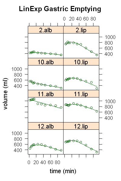
It is best to use trellis graphs in a two-step approach: first generate the concept of the plot, assign it to a variable; then print it to a window by default, or to some graphics file as show below. In interactive mode, writing plot(ge0.pred) would have worked, but there are a few surprising cases where this fails, so better do it stepwise from the start. The default layout produced by this plot does not show the structure of the data nicely, so we give it another try with a forced layout, adding main title, x-label, y-label, and putting low-numbered subjects table-wise at the top.
# A few bells ...
p = plot(ge0.pred,
        layout = c(2,4),  # grid of 2 horizontal, 4 vert
        aspect = 0.7,     # aspect of each panel; 1.0 for square
        main = "LinExp Gastric Emptying",
        xlab = "time (min)",
        ylab = "volume (ml)",
        as.table = T      # ordered top to bottom
        )
print(p)
Default printing goes to a window, but by opening an device, several file formats can be created. Besides the bitmapped png-Format, the scalable postscript format is a good choice for inclusion in more recent version of Microsoft Word; for older Word versions, you must convert postscript to emf fist.
# Output the plot to a png file
trellis.device("png",file="gastempt2.png",
  width=400,height=600,theme="col.whitebg")
print(p)
dev.off() # don't forget to close the device
Here is a view of the png file. Note that the curves with a value of kappa>1 show a rise after the initial filling of stomach; only 10.alb and 11.alb, the two failures in the nlsList fit, drop monotonously.
Diagnostic Plots of Residuals
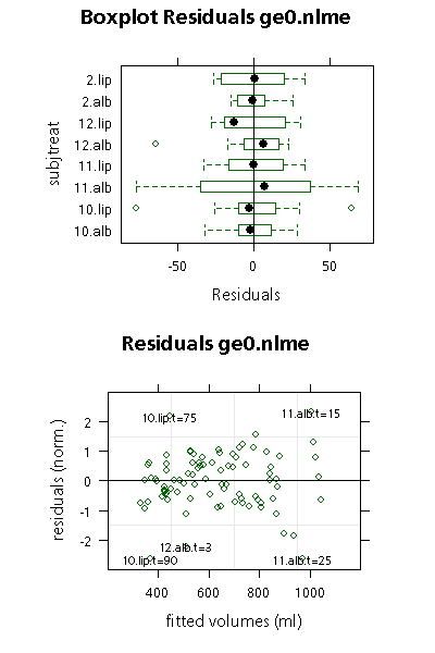
Diagnostic plot of the residuals of a fit a statisticians best friend. Contrary to R2 values, they are worth a look both for linear and nonlinear fits. Residuals are the differences between predicted and observed values, normalized in such a way that we should expect about 95% of the data values in a band of plus/minus 2 around zero. The package nlme provides a very large toolkit for plotting of residuals, from which we will show two here.
#trellis.device("png",file="gastempt2_diag.png",
#  width=400,height=600,theme="col.whitebg")
If you plan to save the graph to a file, remove the two # starting the above lines.
p = plot(ge0.nlme,subjtreat ~resid(.), abline = 0,
    main= "Boxplot Residuals ge0.nlme",aspect=0.7)
print(p,split=c(1,1,1,2),more=TRUE)
The details about the first line are documented under plot.lme. The second line is an interesting variation on the print.trellis subject. We plan to put two graphs on one page, so we split the page into 1 column and 2 rows (third and forth parameter of split), and we plot on grid field (1,1) of it (first and second parameter). By adding more=TRUE, we tell trellis that more plots are coming.
p = plot(ge0.nlme,
    id=0.05,  # mark significant deviations
    idLabels = paste(ge$subjtreat,ge$t,sep=".t="), # add time
    main=  "Residuals ge0.nlme",
    ylab = "residuals (norm.)",
    xlab = "fitted volumes (ml)",
    aspect=0.7,
    cex=0.7,     # force smaller characters
    xlim=c(200,1200), # larger x limits
    ylim = c(-3,3) # symmetric
    )
The core line above simply reads plot(ge0.nlme), everything else is decoration. The most interesting part are the lines id and idLabels, where we ask that data points with that are probably outliers should be marked by subject, treatment and time.
print(p,split=c(1,2,1,2))
And we the graph into field (1,2) of a (1,2) grid. We could have added more=FALSE because nothing more will be plotted on the page, but this is the default.
#dev.off() # remove first # for png output

The boxplot shows non-normalized residuals, with deviations of measured from predicted are measured in ml. Half of the observed values are are within the boxes. Outliers are marked by circles.

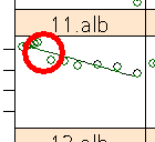
For subject 11, albumin, there is a large spread of values, coming from the systematic hiatus between 15 and 25 minutes after start. This is not a misreading of data that could be removed, so we have to live with this effect.
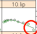
Subject 10, lipid has two outliers in both directions, because the last data points are off. This could be a wrong reading of the last data point alone, but we cannot be sure about it because it is the last reading, so we have to keep the value.

The second plot shows normalized residuals against fitted values. Here we have marked the data points with values of normalized residuals beyond 2 in both directions as possible outliers, which could help us identify critical cases. In addition to the outliers, we note a slight increase of residuals spread at larger values; chapter 5.2 of PB shows how to handle this rather common case in biological data analysis.
In gastempt3 we will show how the same method can be used to fit the conventional power exponential function, and we will compare the solutions.


 Dr. Dieter Menne
 07072 1263 688
