Regression Mysteries
Dieter Menne 15 Juli 2017
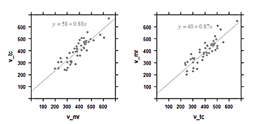
In the paper by Hoad et al. (2015), two different methods to measure gastric content volume (GCV) were compared, by MRI and by gamma scintigraphy. A regression line was computed which is the best prediction of GCV(MRI) given GCV(Scintigraphy). The slope was close to 1, which was interpreted that both methods were equivalent within the error limits.
Figure 6 from Hoad et al. (2015)
In regression, the values on the x and y axis are not equal before the mathematics. The regression slope is determined under the assumption that the values on the horizontal axis measured by scintigraphy are known without error (“given”), and those on the y axis from the MRI records are error-affected. Thus regression parameters are good descriptors if the values on the horizontal axis are from an almost-accurate gold standard, and values on the vertical are error-affected volumes measured by MRI. In this example, both methods are not accurate, so the diagram with exchanged axes would also be valid.
In the diagrams below, artificial data were generated so that the values plotted against each other are equal on average. This simulates the case when both methods are comparable in accuracy. One should expect a slope close to 1 for the regression line.
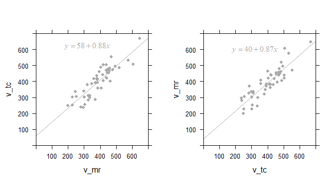
Left: Linear regression of scintigraphic volume by MRI volume; and the same data with axes inverted (right)
The computed regression curve is shown in the inset. For the plot of
v_tc against v_mr, the slope is 0.88. We had expected a value of 1,
so is the smaller slope estimate a quirk of randomness?
When we plot the same data inversely, i.e. v_mr against v_tc, we
should expect a slope of about 1/0.88=1.1. But actually the slope of the
regression line 0.87!
This is “regression to the mean”, and has often misinterpreted, even in statistical textbooks. Do scientists get fooled by Galton’s regression to the mean? All the time!
Is correlation better?
Somewhat: Correlation is symmetrical: it does not matter if we plot
v_mr against v_tc, or the inverse. The correlation coeffient in both
cases is 0.88. Note: it is purely accidental that the numeric values of
the regression and the correlation are the same!
No: because the correlation coefficient does not require that both
measures are equal, only that they are linearly related. If we multiply
v_mr by 10 and add 50, the correlation with v_tc will remain the
same, even if the two methods produce totally different results.
Lin’s concordance index
Lin’s concordance index comes to the rescue. It is symmetrical, and can be interpreted similar to the well known correlation index r, with the additional requirement: we expect that the value are the same, not only related by a linear equation.
Lin’s concordance index has a value of 0.87 for these artifical data.
This is similar to the value of the correlation index, but keep in mind
that the data were created to be equal. If we would multiply v_tc by
10, the correlation index r would not change, but the concordance index
becomes 0.01, indicating that both methods give markedly different
results.
And how to illustrate this?
I have made fun of medical researcher’s tendency to reduce statistics to p-values, Bland-Altman-plots and AUC. Nevertheless, here is a case where a so-called Bland-Altman plot can be used to illustrate the relation between the data without singling out one of the two methods as the error-free gold-standard.
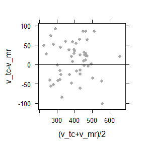
Bland-Altman plot of the difference between against the average of two methods. The cloud is symmetrically distributed around the horizontal axis, and there is no trend. This indicates that both methods are approximately equivalent.
Principal component line
The principal component line can be regarded as a regression line where both axes are on a par. It is therefore better suited to show how two different methods for gastric volume measurements are related.
# http://geog.uoregon.edu/GeogR/topics/pca.html
#
# Data frame d has two columns, one for each method
fit = princomp(d)
load = fit$loadings
slope = (load[2,]/load[1,])[1]
mn <- apply(d, 2, mean) # Data mean
intcpt <- mn[2]-(slope*mn[1]) # Intercept
#
# Compute regression
lmfit = coef(lm(v_mr~v_tc, data = d))
plot(d, cex = 0.5, pch = 16) # plot data
abline(intcpt, slope[1], lwd = 2) # plot principal line
abline(lmfit[1], lmfit[2], col="blue", lwd = 2) # plot regression line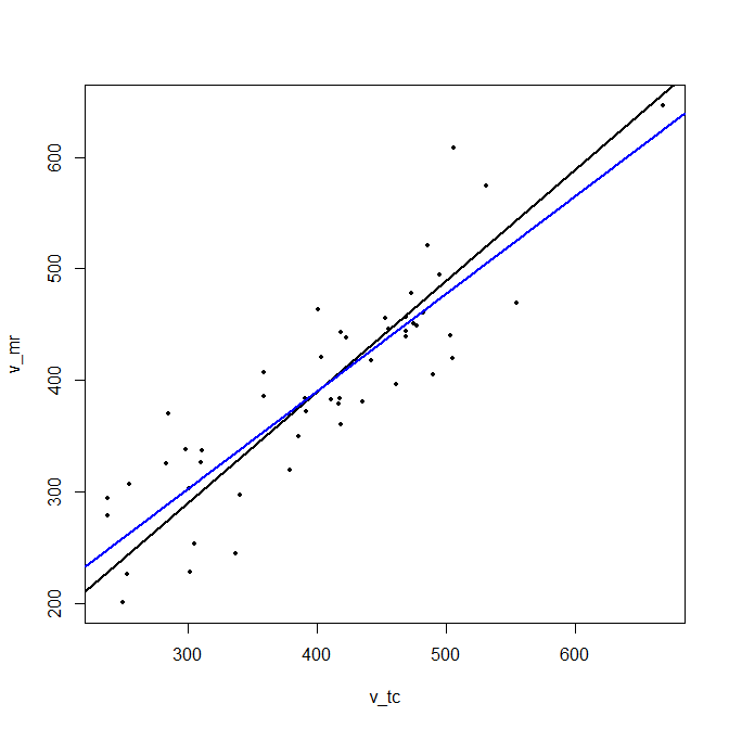
It has a slope of 0.997, while the regression line has a slope 0.874.
Summary
- The regression is the best predictor for the value on the vertical axis (with error) given the error-less value on the horizontal axis. The axes are not interchangeable.
- The slope of the principal component given an estimate of the relation between two measures, trying to forget about variance.
- The correlation index is lower than 1 when two methods are not linearly related, or when the error is large.
- Lin’s concordance results gives values below 1 when the results from two methods are not in a 1:1 relation, both from measurement error, different slopes or offsets.